Everything you need to look and feel premium.
From brand strategy through to a production-ready design system — a complete visual foundation for your business.
Brand Strategy
Positioning, messaging hierarchy, and tone of voice documentation. Your brand needs a point of view before it needs a logo.
Visual Identity
Logo system, typography, color palette, and usage guidelines. A full identity that works at every size and in every context.
Design System
Figma component library with variants, tokens, and auto-layout. A system your developers can implement without daily design consultations.
Web Design
High-fidelity Figma designs matched to responsive breakpoints. Pixel-perfect, production-ready, and ready to hand to your development team.
Motion Design
Micro-interactions, loading states, and transition guidelines. Motion that communicates brand personality without sacrificing performance.
Brand Book
Print-ready PDF guidelines covering every application. Everything your team, agencies, and partners need to use your brand correctly.
Our process, from brief to brand book.
A structured process that builds strategic foundations before touching a pixel.
Discovery & Research
Brand audit, competitor analysis, audience research, and positioning workshop to anchor the creative brief. Creative direction without strategic grounding is just decoration.
Concept Development
Three distinct creative directions presented with rationale. One direction selected and refined to full system depth — not iterated into mediocrity by committee.
System Build
Full Figma component library, brand guidelines, and all application designs delivered as production-ready assets. Everything connects — nothing is one-off.
Handover
Brand book, Figma file handover, font licensing guidance, and a walkthrough session for your team. You leave knowing how to use every element of your brand correctly.
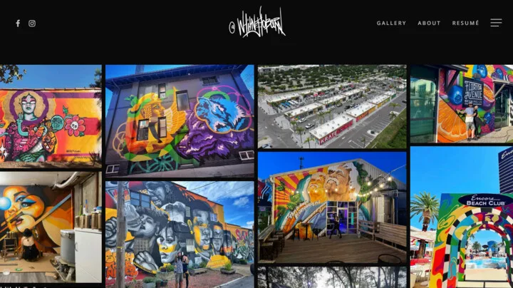
A system, not a collection of files.
Colour tokens, type scales, and components that speak the same language — and a before/after that shows why it matters.
Every color maps to a semantic token. Developers read --color-primary, never a hex. Swap an entire brand in one variable.
"We offer a full-service marketing solution for businesses of all sizes."
"The growth team for B2B SaaS companies from $1M to $10M ARR."
Ready to build a brand that lasts?
Tell us where your brand is today and where you want it to go. We'll come back with a clear path.
Let's talk